A photography moodboard, explained
A photography moodboard communicates the intended light, composition, styling, color, and feeling of a shoot. Choose one visual anchor, then add references that answer different production questions. This worked campaign example shows how a wide image, a material detail, and a motion study can communicate one direction before the team starts making it.
UPDATED 2026-09-06
Start with a picture of the decision
A photography moodboard should help a photographer, stylist, producer, or client understand the same intended image. It earns its place when it answers a decision that would otherwise be left until the shoot: the quality of light, the distance from the subject, the way a garment moves, or the relationship between a person and a location.
Open Anthem, the example board. It is a fictional coastal campaign with AI-generated concept studies. There was no client shoot, location scout, or paid commission behind these images. The example demonstrates how to explain a direction; replace the material with references you have permission to use before presenting your own project.
The brief: a person inside the weather
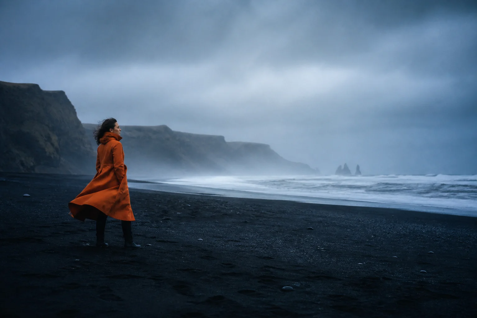
For this example, the proposed image is a small human figure wearing orange against a large, cool coastal landscape. The person belongs to the place rather than conquering it. That sentence gives the team a useful filter. A glossy studio beauty shot might be attractive, but it does not help this particular direction.
Write your own brief as three short statements: what the image should make someone feel, what must be visible, and what should stay out. A product launch may need a recognizable silhouette. A portrait may need the subject to feel at ease. A campaign may need several crops that still belong to the same visual family. Those requirements belong beside the references, where the people making the images can see them.
Read the board as four decisions
| Board element | Decision it communicates | Question for the shoot |
|---|---|---|
| Wide coastal image | The environment carries most of the frame | How small can the person be while the product remains legible? |
| Hand and fabric study | Material and gesture create intimacy | Which close detail earns the transition from landscape to person? |
| Four color swatches | Orange is the focal accent; the surroundings stay cool | Which styling and location choices compete with that accent? |
| Motion and listening references | The feeling needs time and atmosphere | Does the edit leave room for a breath, or cut away too quickly? |
These are proposals for this example, not universal photography rules. A high-energy sports campaign could need the opposite balance. The value comes from making the intended balance visible enough to discuss.
Choose a hero before adding support
Pick the one reference that makes the strongest argument. Give it more space than the others. On Anthem, the wide landscape establishes scale, weather, and the orange accent in one image. The closer image earns its position by answering a different question about touch and material.
Avoid choosing five references that all perform the same job. If three images communicate the same light, keep the one that is clearest and put the others in your working collection. A presentation board should show your selection. It does not need to display every step of the search that led there.
A useful test is to cover each supporting image in turn. If removing it does not change what the viewer understands, it may be redundant. If removing it makes the styling, lighting, or action ambiguous, it probably has a specific role worth naming.
Caption the choice, not the object
“Orange coat” names what is visible. “Use one warm shape against a cool environment” explains a choice. “Rain” names a condition. “Let water and fabric texture show in the close-up” gives someone a direction to work with.
Keep annotations short and place them beside the relevant image. Reserve longer production notes for a separate section or document. The board needs to remain readable when you pull back to show the full arrangement. Captions should sharpen the image, not force the viewer to read a paragraph before noticing it.
When references disagree, say so explicitly. You might borrow the crop from one photograph and the light from another. Without that explanation, someone can reasonably assume you want both images reproduced in full. A short note such as “light only; ignore styling” removes that uncertainty.
Keep a moodboard distinct from a shot list
The moodboard establishes the visual direction. A shot list records the images the team needs to capture. They can sit near each other, but they serve different jobs. The first answers what the pictures should feel like; the second helps organize what must be made.
For Anthem, the board suggests a wide environmental frame, a human-scale detail, and a motion beat. Turning those into a shoot requires decisions the demo does not contain: actual location access, weather planning, talent, wardrobe, crew, equipment, usage rights, and production constraints. Do not treat a compelling concept image as evidence that a real location or setup is feasible.
Add movement when it changes the brief
A still reference cannot fully explain pacing. Anthem includes a deliberately simple animatic: a slow camera move across a generated still. It is labeled as a concept study, not live-action footage. The purpose is to ask whether the direction benefits from stillness and a gradual reveal.
The separate water recording is a listening reference from the existing demonstration library. It is not production sound from the pictured coast. Keeping those distinctions visible lets a team discuss atmosphere without mistaking a concept board for documented production material.
If your project is stills-only, remove references that do not inform a decision. If sound or movement does matter, the video and audio moodboard guide shows how to give each medium a clear role.
Walk it, then let someone explore
Present the hero first, then the human detail, then the motion and palette. End with the full board so the viewer can see how the decisions relate. Ask one specific question, such as whether the balance between environment and product is right. A broad “what do you think?” invites reactions without identifying the decision you need.
Afterward, share a viewing link and check it in a signed-out browser and on a phone. Keep a written summary of the next action in your normal project workflow. A readable board helps the conversation; it does not replace an agreement about scope or production.
Start from the photography shoot template, or copy Anthem with “Make it mine.” For a broader moving-image brief, continue to the director's treatment example. Keep the structure that helps, replace every reference deliberately, and let your own project's constraints change the board.
Questions
- Can I use this example as a starting point?
- Yes. Open the Anthem board and choose Make it mine to copy it into your account. Replace the concept references with your own material and adapt the structure to your project.
- Is Anthem a real client project?
- No. It is a fictional campaign demonstration with AI-generated concept imagery. The animatic is a camera move across a still; it is not live-action footage.